
Credentialing Software Simplified
Product Design, Oct 2021 - Jan 2022
Background
Silversheet is a web-based software that helps healthcare facilities manage provider credentialing. For healthcare facilities credentialing is important these reasons, it provides patient safety, essentially granting the privileges to perform procedures they have demonstrated to be qualified to perform. Compliance with healthcare facilities and insurance networks are also a part of credentialing regulatory standards. Lastly, the credentialing process allows facilities to evaluate providers for potential liability they may pose by providing care at their facility/insurance network.
Scope of Work
User Experience Design
User Interface Design
User Research, Prototyping, Agile Methodology
Challenge
Silversheet today is an important product for all that it does but its legacy framework is outdated and in need of a full redesign. As UX designers already working on improving various workflows of the product experience we were aware that this legacy application would need to be rethought to a completely new experience. The task initiative was huge as it would involve a completely new UI framework, interface architecture, navigation, dashboards, and so forth to ultimately create the leading product, reducing the time it takes to complete credentialing for facilities/providers.
Impact
Even though my time at Silversheet ended, our entire rebuilt effort to this application will notably provide a new user-centric approach improving overall design, efficiency and visibility of the entire appointment and maintenance processes, saving time, and most importantly improving credentialing turn around and completion.

Initial Approach
For me, step one is always having a clearly defined problem. The design team knew that at some point our company stakeholders would want us to fully reimagine the Silversheet experience. For the business incentive, redesigning Silversheeet would not only represent an improved UX/UI but ultimately have a product that would reduce the time it takes to credentialing. With this said our UX team proposed to focus the redesign on three specific workflows:
1. Login experience > Dashboard design > Sending appointment information to a provider
2. Need to manage and review provider application, verify, approve, completing the appointment
3. Expiring credentials, how should those be managed
As part of a team of two UX designers, my role was to tackle the new dashboard experience. To me, this was something I had never done before so I asked myself and wrote down as many things that I felt could be important.
Quick Observations
What would this include? What key elements would I defiantly need to include for version 1?
Should the dashboard interplay with information architecture, navigation for example?
Would I have access to all the research gatherings from the product team to analyze?
Review customer video recordings where there is mention of this missing dashboard.
How would I be able to shadow some of our clients, find their likes, dislikes, needs, and frustrations?
Talk to credentialing managers to actually understand their day-to-day use of Silversheet, what is the visibility they need of the system, what opportunities are we missing.
What are those alternative workflows or software they may be used to manage their credentialing?
What are those basic expectations that a user would find crucial, important to nice to have for a future release?
Persona Mapping
Identifying our entire user base served as a starting point to understand who all the users were and make sure all their primary features and needs were addressed. As a designer, I use the example of needing to know what are all the features the client wants in their kitchen before I can come up with design options. The persona documentation pointed out the different ranges of roles and titles of users, as well as their level of technical knowledge they had, how they used the platform, and how often.
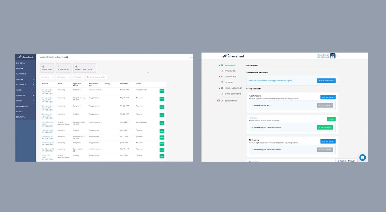
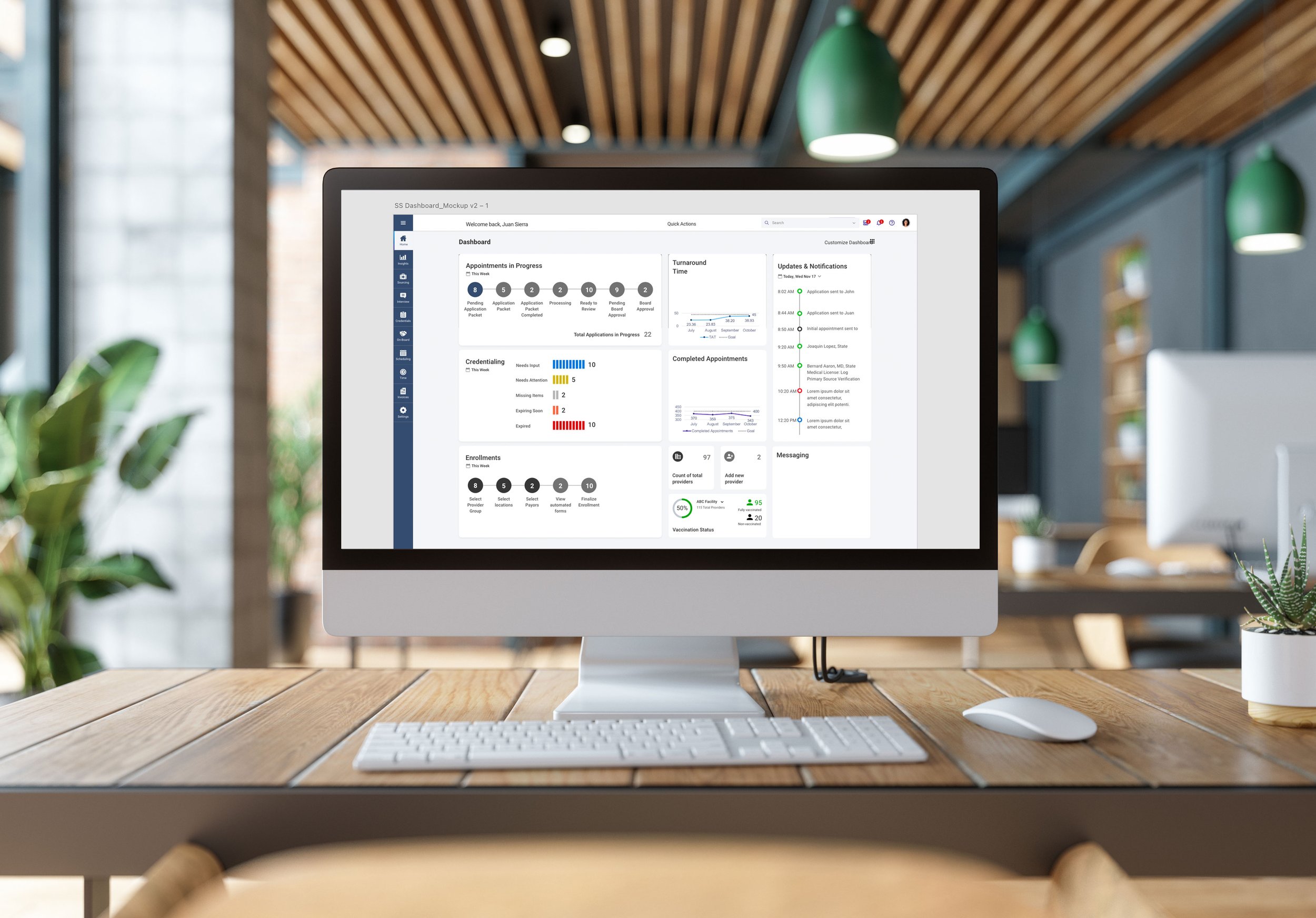
The current placeholder
As seen above are both the facility/ credentialing manager dashboard and the provider dashboard. Both screens identify themselves as dashboards but in reality, there are many elements that are missing from a basic dashboard. In its current state, this legacy product suffers from multiple setbacks in its interface like site architecture, navigation, the entire user interphase is below standard, inconsistencies, confusing workflows, basic hierarchy issues and many missing key features.


Competitive Analysis
During the discovery phase of a project I am very adamant and curious to figure out what the competition is doing. I would even argue that its as important as talking to your audience and performing user research. Personally, I take some time to go through each of the competitive gatherings, review they solutions and their features, judge their interface design, visual design aesthetic, marketing website, product videos and product review sites. During this time I like to gauge where our product compares with that of the competition.

Outside Inspiration
During either discovery and ideation I like to step back and tap into similar interface solutions that both inspire visual astetic and interface functionality.

Putting pen to paper
After initial research phase, I proceeded to create Initial wires that ended up more like block-framing to work fast and iterate as many modules I found important to include. In the example above, I drew up very fast sketches that would later be positioned into a logical order based on relevance and team feedback.

Inspiration and Implementations
At the ideation stage, I like to think outside of what the current product offers and interject outside references to possible added elements that could be incorporated into our design solution. In the example above, I presented to the UX/product team some initial ideas of both internal messaging and credentialing manager to provider communication not currently present in our current platform.
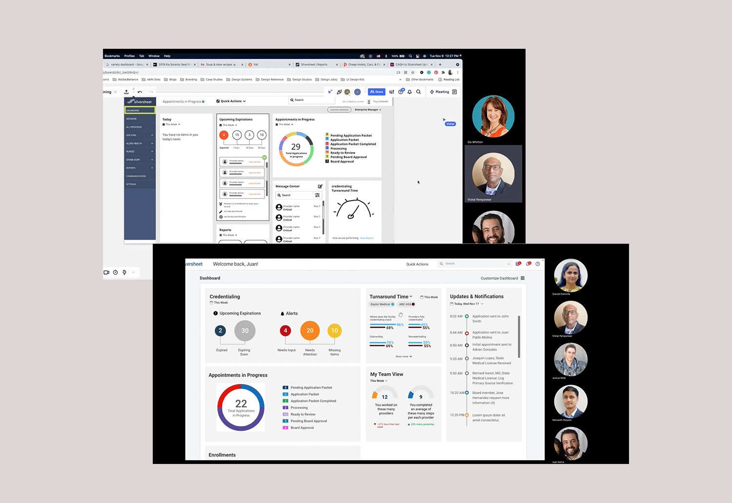
Design Thinking Collaboration
Before going directly to our customers for feedback I presented my initial proposed ideas to the UX team and product management owners. The primary focus was centered around their initial thoughts about what they saw. Obviously, I recognized the product managers were not the intended users but their knowledge of the product and of its users would draw out early team observations and feedback.


Through requirements gathering meetings our team identified what where the most important components to include in the CM dashboard like turn around time and completed appointments, and quality review

SOLUTION
Through a three-month project duration, I contributed to setting the foundational change in interface design direction for the improvement of this product. For the work specific to the dashboard, I helped facilitate our requirement gathering meetings with clients and customers to help better understand their needs and expectations around the system visibility and capability. We built initial dashboard mockups that integrated the most relevant and sought-after features from our customer’s feedback as well as improved features like CAQH integration and board approver to credentialing manager workflows.